Challenge
Experimenting with craft and hobby classes can be daunting because of the potential expense, the substantial time investment, and the uncertainty about the necessary level of prior knowledge or experience to excel in the class.
Solution
The Whimsy app allows users to explore classes affordably and without a long-term commitment, making it easier and more enjoyable to discover new hobbies. For local craft and hobby studios, Whimsy helps fill empty spots in their classes, attract new customers, and generate additional revenue.
THE PROCESS
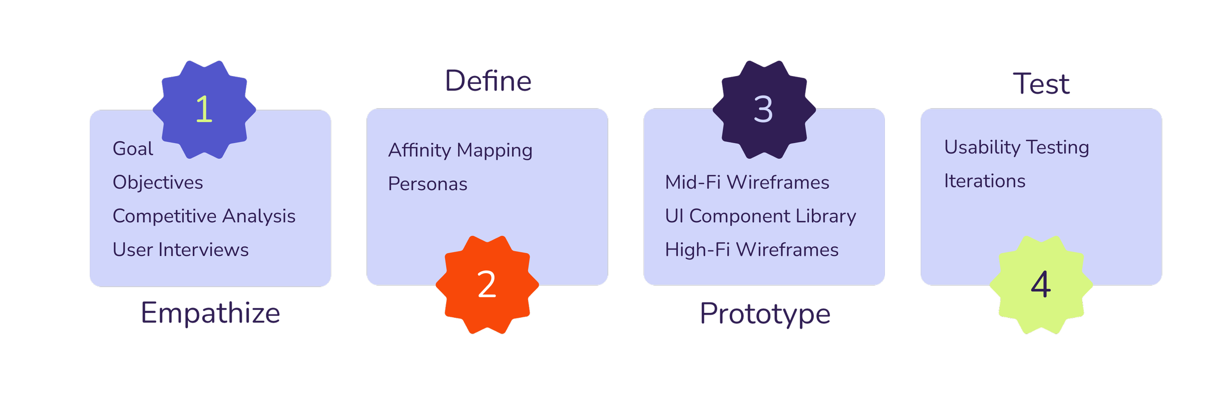
1. Empathize
We set out to find what pain points users experience when deciding to try a new craft or hobby and what persuades or dissuades them from signing up for a class.
OBJECTIVES
We need to learn the motives behind users signing up for classes
We need to learn how they are choosing which classes to sign up for
We need to learn what ultimately drives them to go ahead with a class
COMPETITIVE ANALYSIS

INTERVIEW FINDINGS
5 Participants | Previous attendees of craft/hobby classes
Participants were split on whether they liked to try hobbies by themselves or with a friend, partner, or family member
People experience a wide range of emotions when trying new activities — excitement, anxiety, stress, satisfaction, disappointment
Cost and convenience are important when choosing a class
Overall, participants like to try new classes as a fun activity, but would be open to continuing the hobby long-term if they liked it
2. Define
A user persona was created to represent the app's target demographic. All decisions were made with this persona's goals in mind, ensuring that each choice contributed to helping users achieve their intended purposes for using the app.
AFFINITY MAP

USER PERSONA

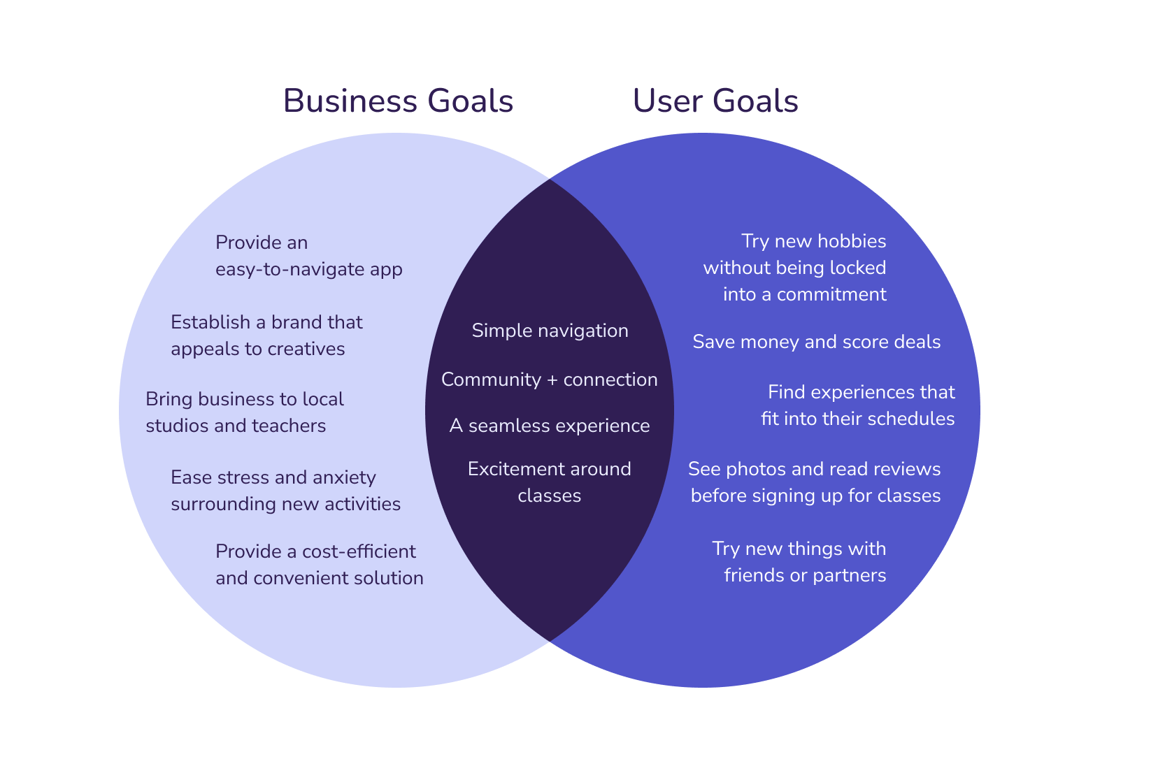
BUSINESS + USER GOALS
3. Prototype
A bright and playful logo and brand identity were designed for the app. The brand’s values of creativity, community, and passion were used to drive the brand creation.
Low- and mid-fi wireframes were created and the Whimsy branding was applied to the final high-fi mockups.
SITE MAP
The first site map shows the original information architecture of the site. Mid-fi testing revealed some slight confusion around terminology and organization, which led to the final site map, shown second.


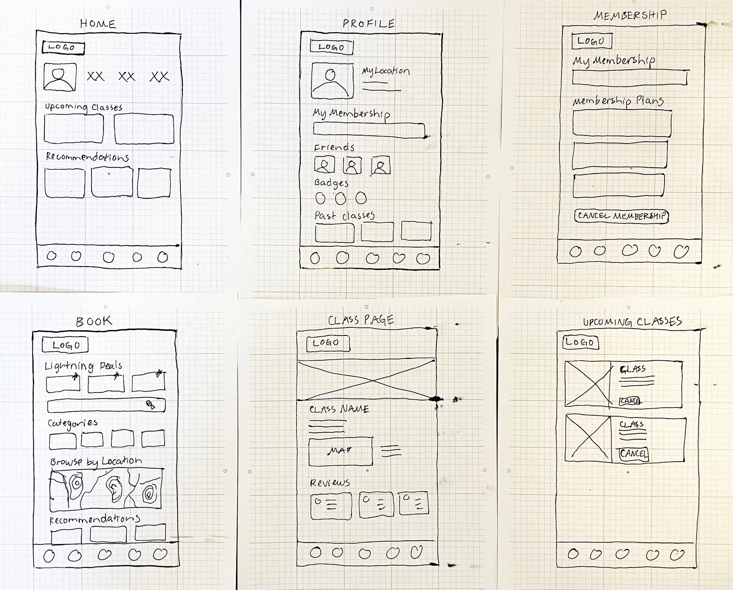
LOW-FI WIREFRAMES
BRANDING AND UI LIBRARY

MID-FI WIREFRAMES

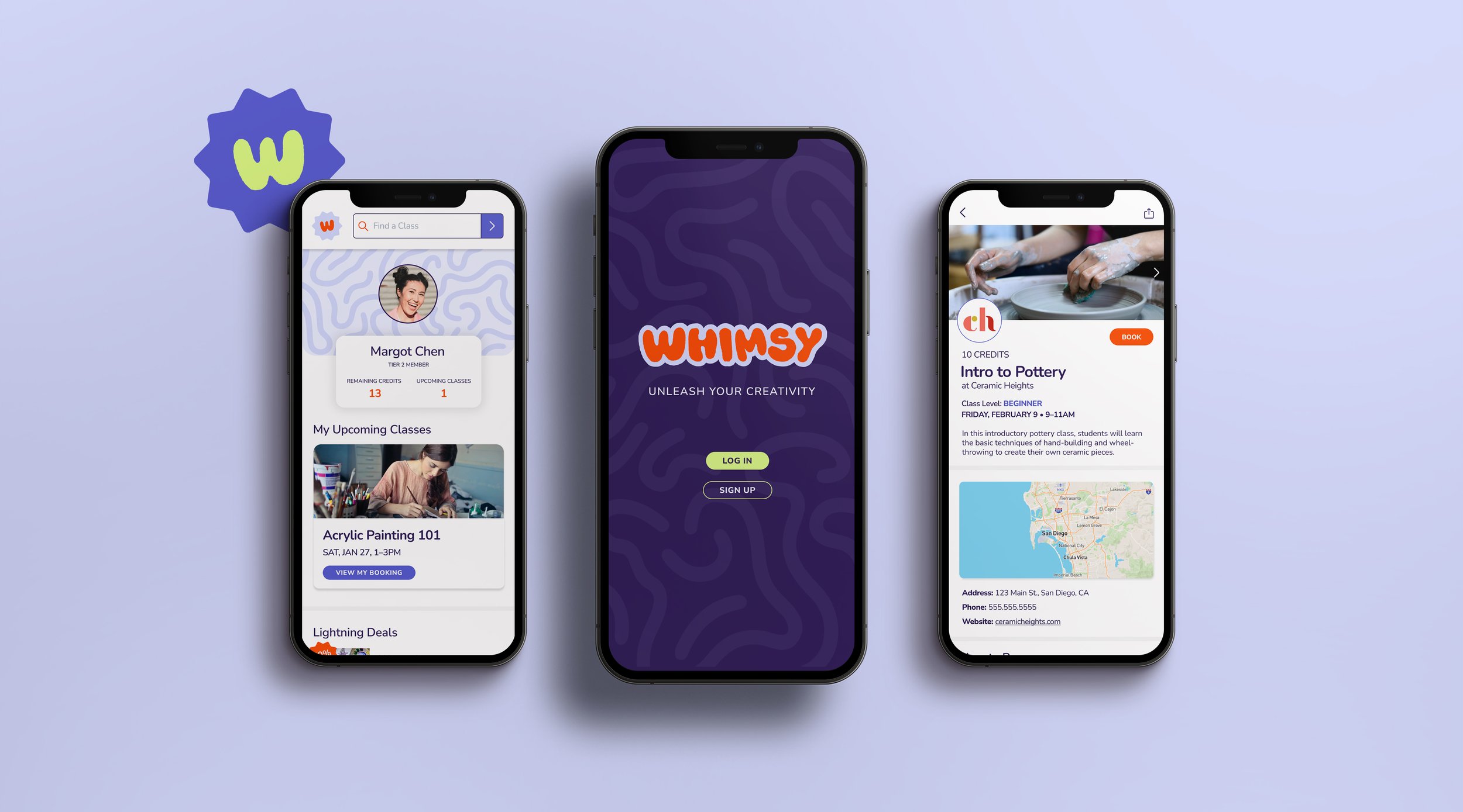
HIGH-FI WIREFRAMES

4. Test
Usability testing was performed twice – between mid- and high-fi wireframing, and after high-fi wireframing. This allowed for a round of changes to be made with a lower impact to time and resources before moving into a higher fidelity.
MID-FI TESTING
Mid-fi testing was conducted with Maze, where users were asked to complete a series of tasks and answer several open-ended questions. By asking users to simulate finding and booking a highly rated pottery class and viewing photos of past students’ work, we could see how easy the goals of our user persona were to carry out.
RESULTS
The information architecture was not clear to users - particularly “Book” vs
“Upcoming”
The button to book the class could use more contrast/stand out more
It wasn’t clear that the time slot was clickable to go to the class page
The search bar did not stand out to several users and no one seemed to find the “See more” link when browsing class categories
Users weren’t sure where to find the lightning deals or what they were
Additional notes about testing:
The prototype appeared very small because of the way that the test was set up - this was adjusted for future tests
Not enough links were included in the prototype to navigate backwards in case of misclicks
Average user experience was rated as a 6.4/10
HIGH-FI TESTING
High-fi testing was conducted live via Zoom. The goals of this testing included:
Evaluating the usability of the Whimsy app
Evaluating alternative paths that users might take to complete tasks
Identifying any areas of confusion in the information architecture
RESULTS
Primary CTAs should be filled in/more prominent
User should be able to navigate back without restarting search
Both search bar and “Find a Class” were used to find pottery classes - it’s nice to have two ways to do things
Users mentioned wanting to see more information with the student project photos
Overall ratings increased significantly from mid-fi user testing
ITERATIONS

Navigation was added to return to previous screens without restarting the user’s search
Primary buttons were filled in

3. Navigation was adjusted to be consistent across the app
4. Ratings, instructor, and class title were added to student project page

5. Lightning Deals were added to the Find a Class page in addition to the homepage
6. Credits were added to the class cards so users can easily assess the price
Next Steps
With more time and resources, interviewing studio owners and art teachers would be the next step in this process. While the interviews and testing were focused on making this app user-friendly for individuals, it would be important to better understand the value-add for businesses.
