Aspen Peak Cellars
UX Research | UX/UI Design | Branding | Responsive Web Design
Challenge
Prospective customers frequently explore winery or restaurant websites before choosing to become patrons. The outdated and challenging-to-navigate website of Aspen Peak Cellars may be causing the business to lose potential customers. Visitors encounter visual confusion, a lack of hierarchy, and difficulty completing tasks such as viewing menus and getting a sense of the overall ambiance.
Solution
A simple, responsive design keeps users’ goals of viewing the menu, making a reservation, and browsing upcoming events top of mind. When users can easily navigate the site to find the information they need, they are one step closer to becoming visiting customers.
* Please note this is a student project for learning purposes only, and not affiliated with Aspen Peak Cellars
THE PROCESS
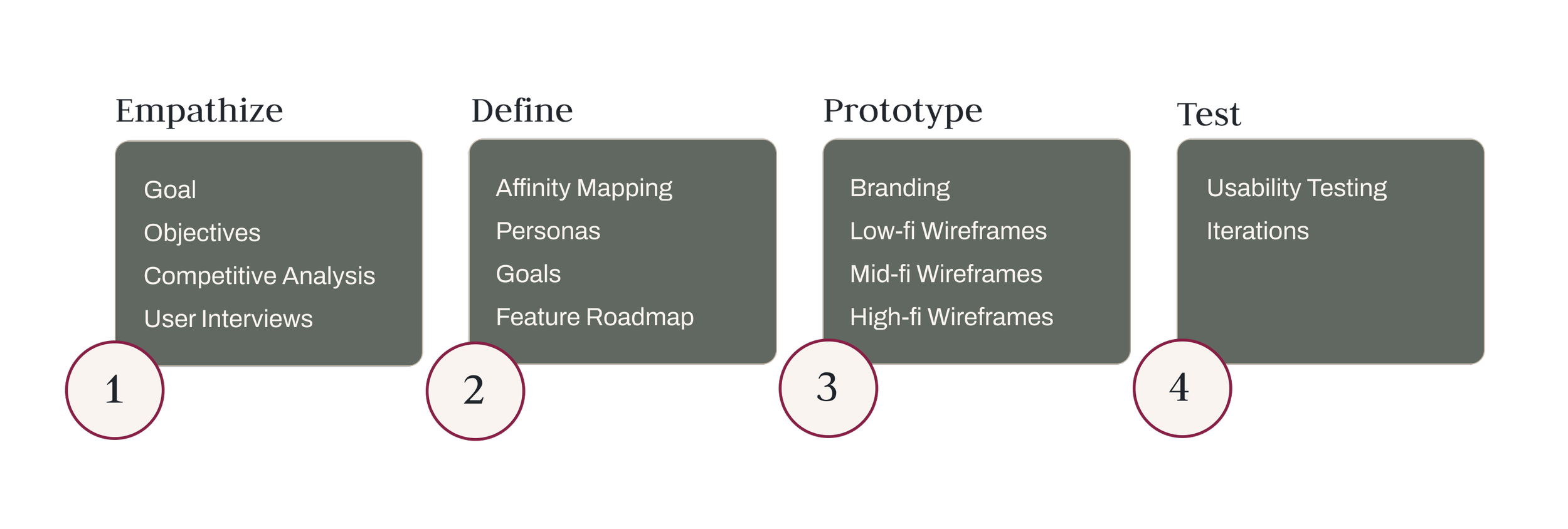
1. Empathize
We set out to find what types of information potential customers are seeking when visiting a winery or restaurant website, and what pain points they have encountered in the past when seeking out this information.
OBJECTIVES
We need to learn what users are hoping to accomplish from visiting the website
We need to learn what challenges they currently face in accomplishing these goals
We need to learn what users are hoping to accomplish from visiting the website
We need to learn what challenges they currently face in accomplishing these goals
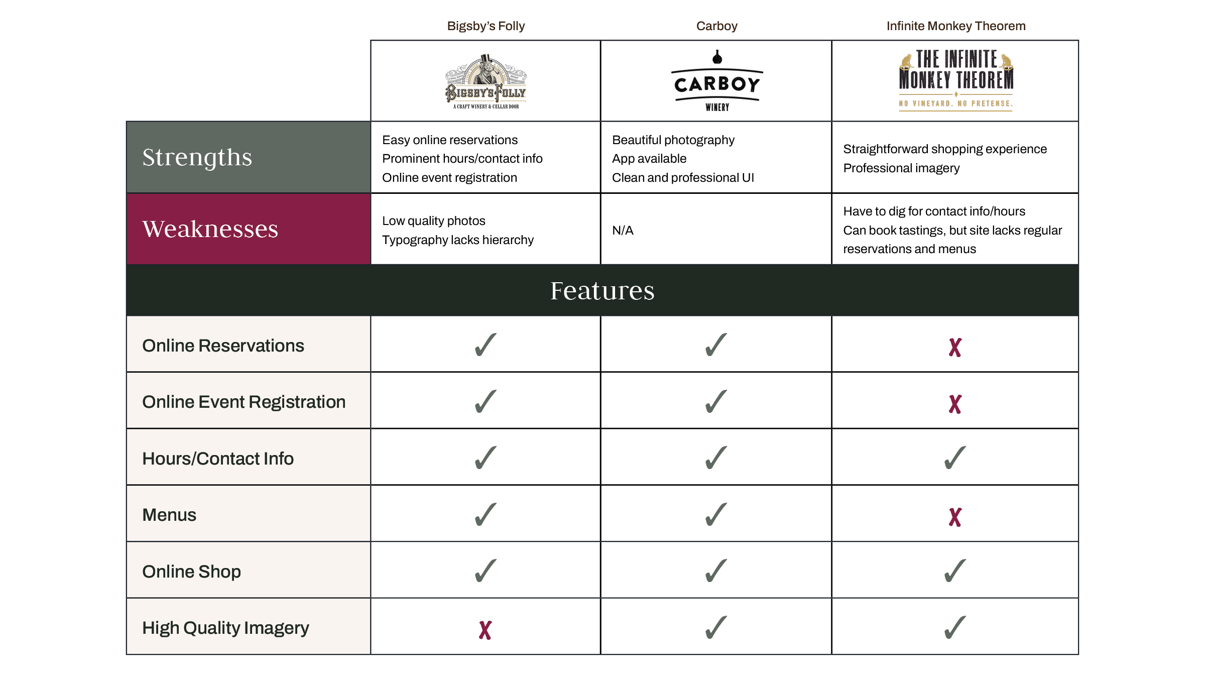
COMPETITIVE ANALYSIS
INTERVIEW FINDINGS
5 Participants | Winery & Restaurant Goers
Users want simple and straightforward online menus
It’s important to see photos of the establishment from a gallery or social media
Users want to gauge whether they will have a positive experience and what the ambiance will be like when visiting the winery or restaurant
If the establishment offers seasonal or special events, these should be easy to find
2. Define
A user persona was crafted to embody the winery & bistro's target demographic. All decisions were guided by this persona's goals, ensuring that each choice contributed to helping users fulfill their intended purposes for visiting the website.
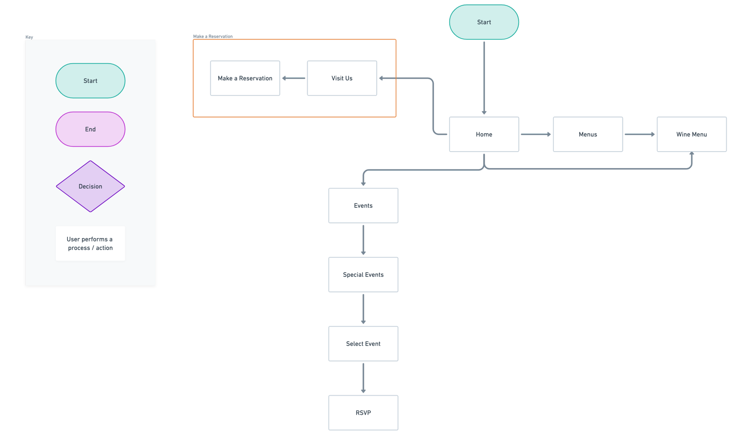
USER FLOWS
User flows show how the user moves through the website and can be seen in detail here.
AFFINITY MAP

USER PERSONA

BUSINESS + USER GOALS

FEATURE ROADMAP

3. Prototype
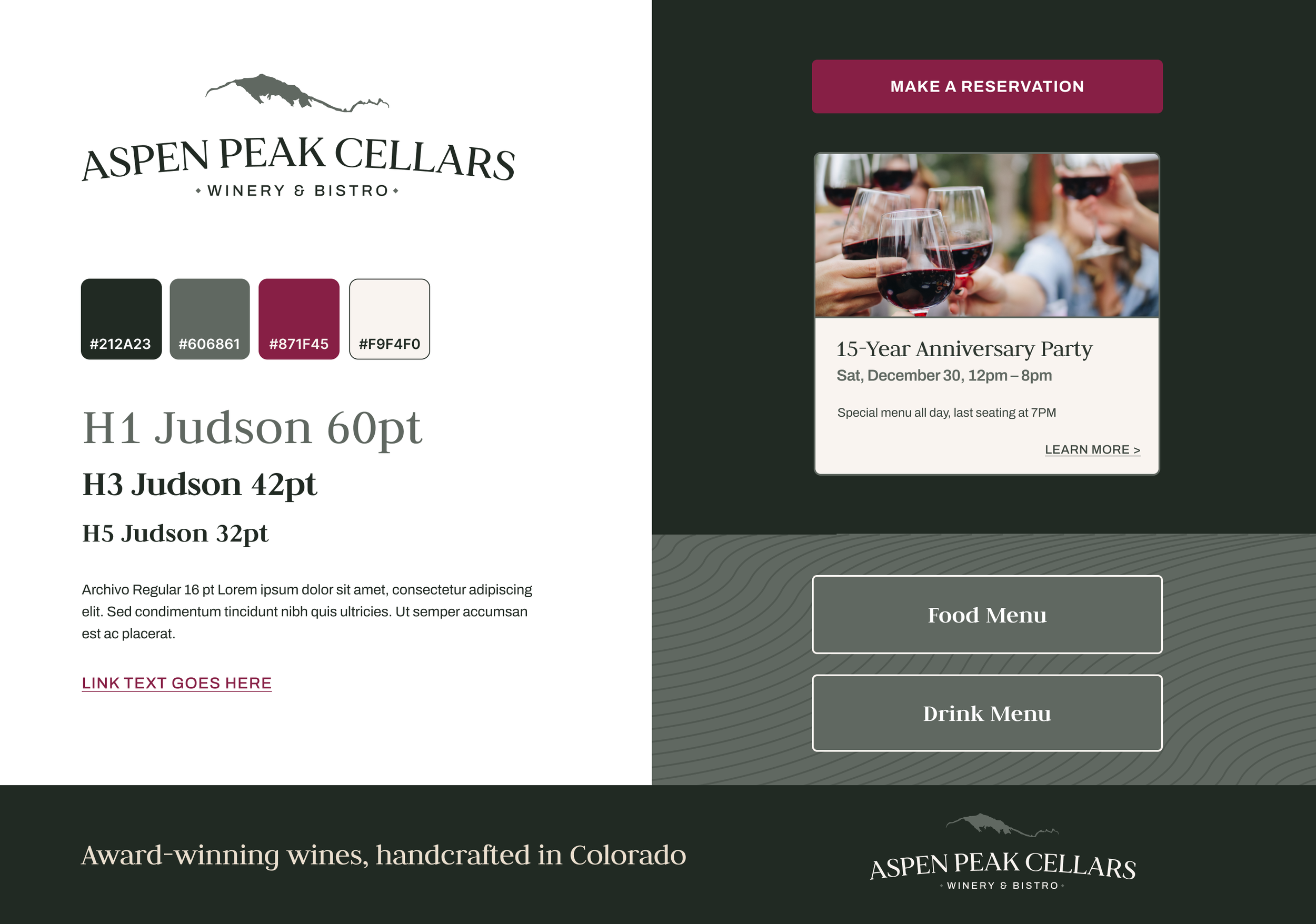
Updates were made to the logo and brand identity design for the winery. We blended elements of the existing brand such as the deep green color and the mountain range imagery, with new elements such as a merlot accent color and modern, refined typography.
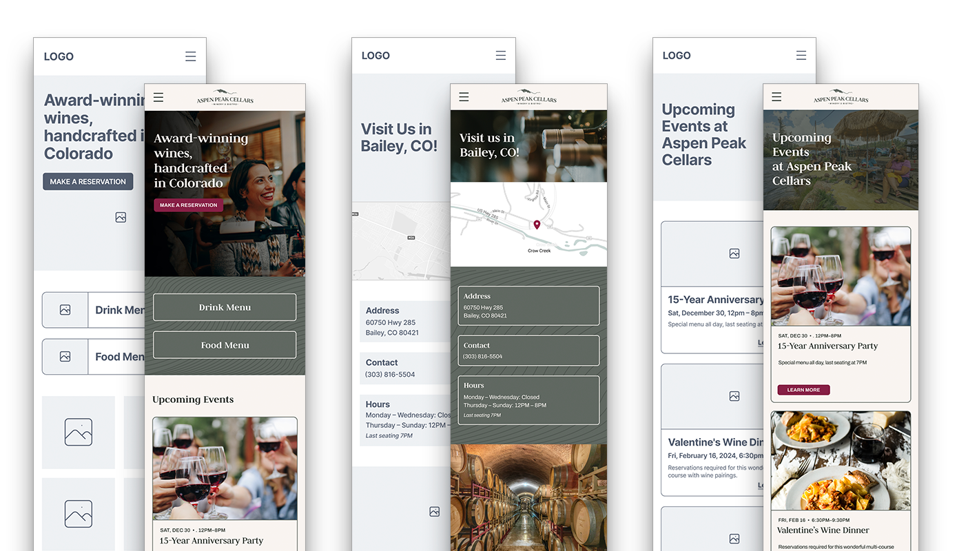
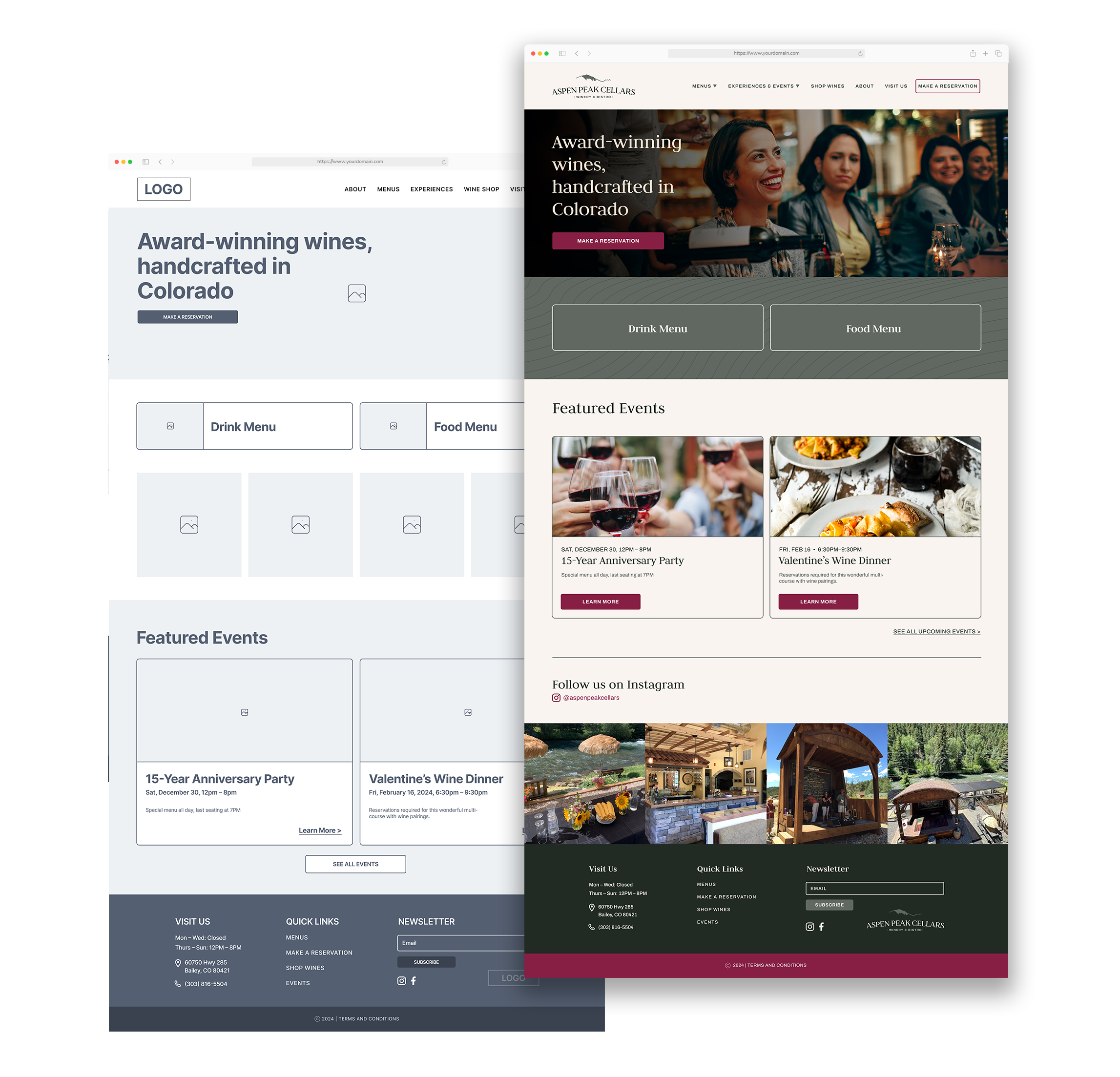
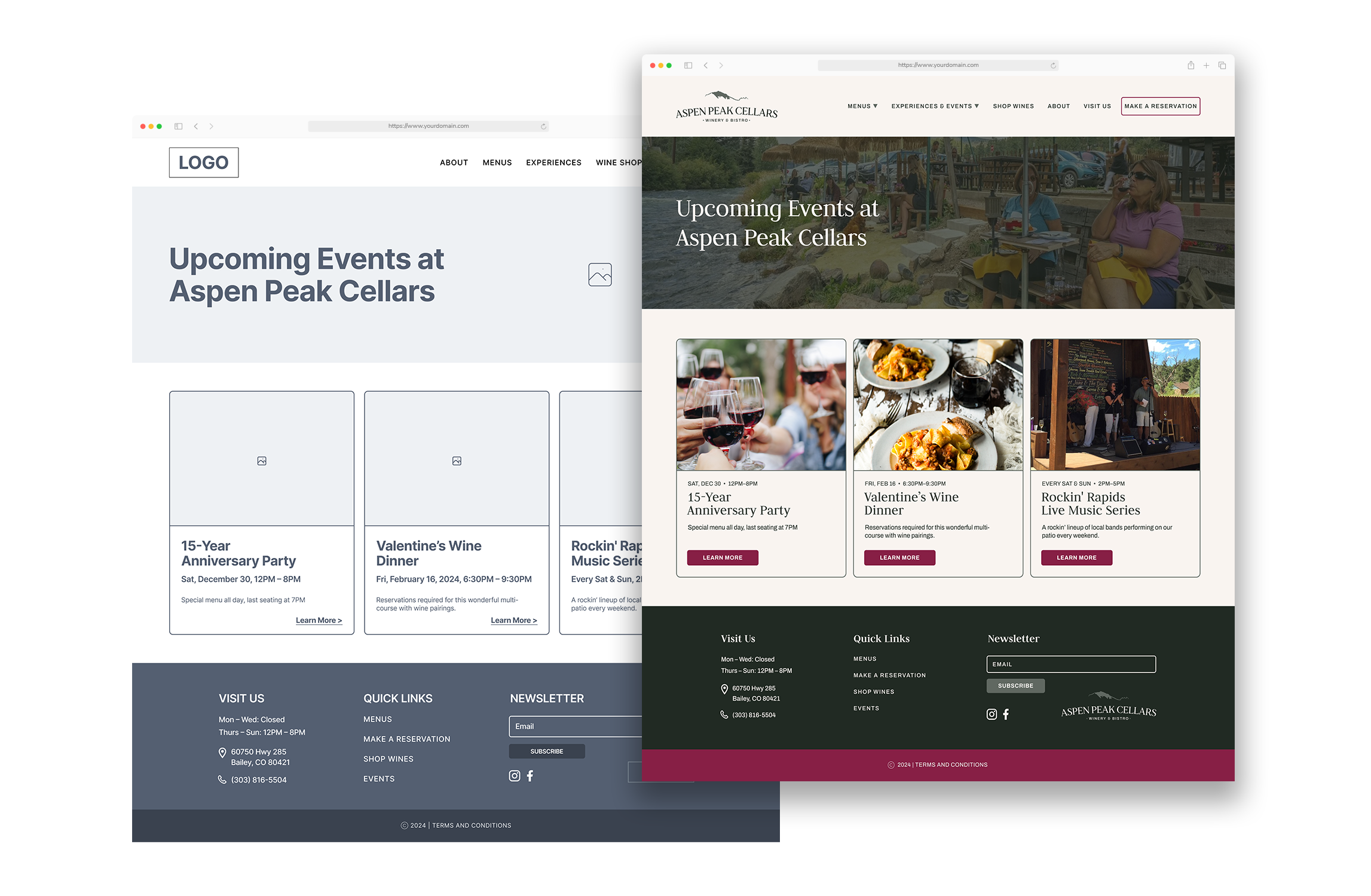
Low- and mid-fi wireframes were created and the newly refreshed branding was applied to create simple and inviting high-fi wireframes.
BRANDING
LOW-FI WIREFRAMES

MID + HIGH-FI WIREFRAMES


4. Test
Usability testing was performed twice – between mid- and high-fi wireframing, and after high-fi wireframing. This allowed for a round of changes to be made with a lower impact to time and resources before moving into a higher fidelity.
Testing was conducted with Maze, where users were asked to complete a series of tasks and answer several open-ended questions. By asking users to simulate making a reservation, viewing a menu, and browsing upcoming events, we could see how easy the goals of our user persona were to carry out.
RESULTS
● Some users were confused where to look for wine flights, this helped me learn the importance of the language used in testing.
● Some users thought that wine flights might be in the experiences section — as a next step when building out the tastings and tours page, I think a mention of wine flights and a link back to the menu would be helpful.
● One of the photos in the Instagram feed is blurry - this doesn’t help portray the ambiance well.
● Having the events available in both the menu and on the homepage seemed to work well as users located the events page from both places. Not everyone knew that ‘Experiences’ contained ‘Upcoming Events’, or that it was a dropdown.
ITERATIONS

The blurry photo on the right was swapped for a higher-res photo of food and drinks. It would be important for the moderator of the website to make sure that the instagram photos in the feed were high-res in order for potential customers to get an accurate sense of the establishment and for the website to appear professional.
Without arrows, it’s unclear that both “Menus” and “Experiences” have dropdown menus associated with them. By renaming “Experiences” to “Experiences & Events” it is more clear where the user should click to navigate to upcoming events.
Takeaways
Through user interviews and testing, we learned that users want a simple and straightforward way to view menus, see hours and contact information, make a reservation, and get a sense for the ambiance of an establishment before visiting. With a modern take on the logo and brand identity, we were able to create an aesthetically pleasing yet clean and easy-to-navigate site for users to accomplish these goals.