
Look Local
UX Research | UX/UI Design | Branding
Challenge
Relocating can be an incredibly stressful experience. Our goal is to ease this burden by providing movers with a solution that helps them discover a new neighborhood where they can find happiness.
Solution
With a site aimed at allowing users to easily explore, sort, and save neighborhoods digitally, movers can feel confident that they are choosing the right neighborhood for their lifestyle and needs.
THE PROCESS

1. Research
We wanted to know what attributes users find important in their neighborhoods so that we could provide a platform that helps them analyze, compare, and choose a neighborhood to move to. We conducted user interviews and sent out a survey to get both qualitative and quantitative data.
OBJECTIVES
Find out what is causing users to move
Learn how movers are researching neighborhoods
Learn why and how movers have picked their neighborhood in the past
COMPETITIVE ANALYSIS
INTERVIEW FINDINGS
User Interviews | 5 Interviewees | Ages 25–35
Desire to be near others of the same age or life stage
Desire to be near bars/restaurants/nightlife
Safety is important but wasn’t deeply researched by most movers
General Google searches, friends, and acquaintances used for research
Moving for school/job
Importance of commute time
2. Define
Through categorizing interview and survey feedback into recurring themes, we crafted distinct user personas that personified our target audience. These personas served as a compass, informing our choices in structuring the sitemap and task flows, illustrating how our users would navigate and complete typical tasks on the website.
PERSONAS


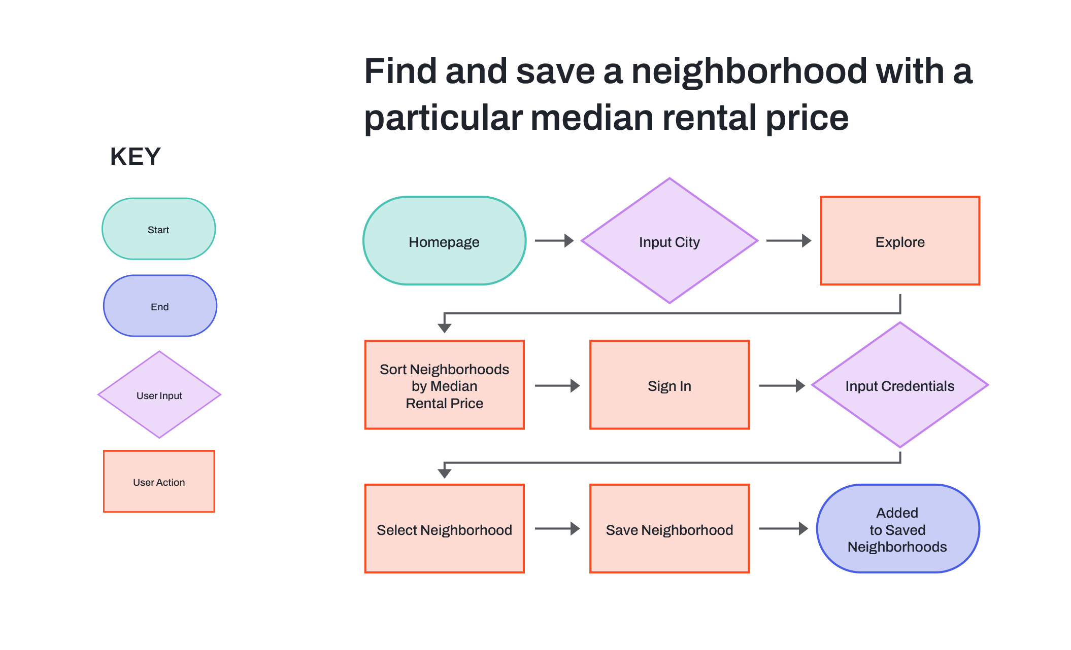
TASK FLOWS

3. Design
We initiated the design process by crafting low and mid-fi wireframes to conceptualize the final product. A moodboard was then devised to visually gather ideas and color schemes. Logos were ideated on using word association and sketching, with the top designs being digitized. Following logo and color palette refinement, we established a UI component library and integrated it into high-fi wireframes.
MID-FI WIREFRAMES
MOODBOARD

LOGO DESIGN

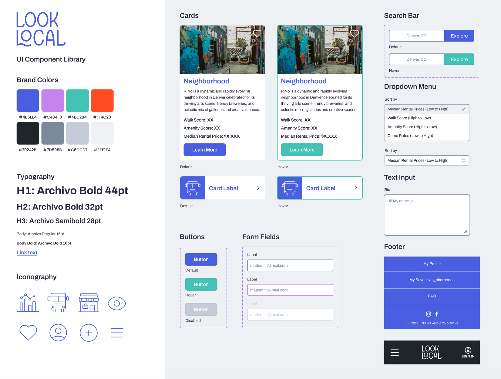
UI COMPONENT LIBRARY
HIGH-FI WIREFRAMES


4. Test
Finally, we performed usability testing to see how easily users could complete our defined task flows. The initial task saw a success rate of 4 out of 5 users, while all 5 users efficiently completed the second task. Observing users interact with the product revealed minor issues that were promptly addressed through iteration.
PRIORITIZATION GRID
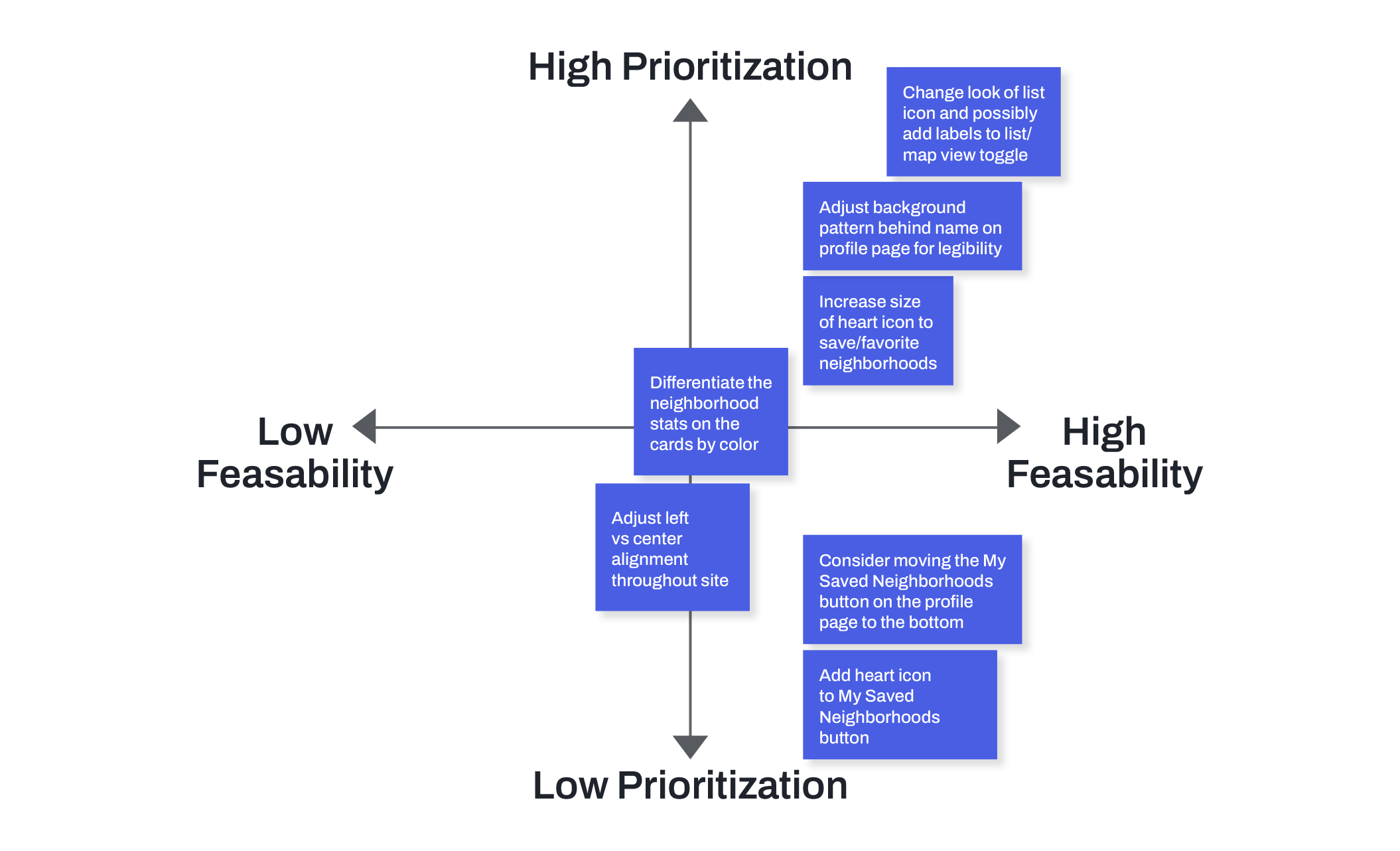
ITERATIONS

The list icon was changed to differentiate it from the hamburger menu
The heart icon size was increased
The neighborhood stats were colored to help them stand out and show their relationship to other neighborhoods
The background pattern was adjusted so the user’s name is legible
The My Saved Neighborhoods button was moved to the bottom of the profile, since most users accessed this page from the hamburger menu
Takeaways
User interviews quickly revealed themes that potential users found important, while techniques such as affinity mapping and a prioritization grid proved highly beneficial in comprehending and structuring the gathered data to design a useful and usable product.
Next Steps
The next focus on this project would be to build out the amenities map portion of the website, which would play into the themes of social connection and walkability that users discussed throughout our research.
