Beyond Realty
Logo Design | Brand Identity | Print Collateral
Challenge
Upon deciding on the name "Beyond Realty," a Florida-based agent set out to create a brand that exuded both sophistication and approachability, capable of resonating across various real estate price ranges.
Solution
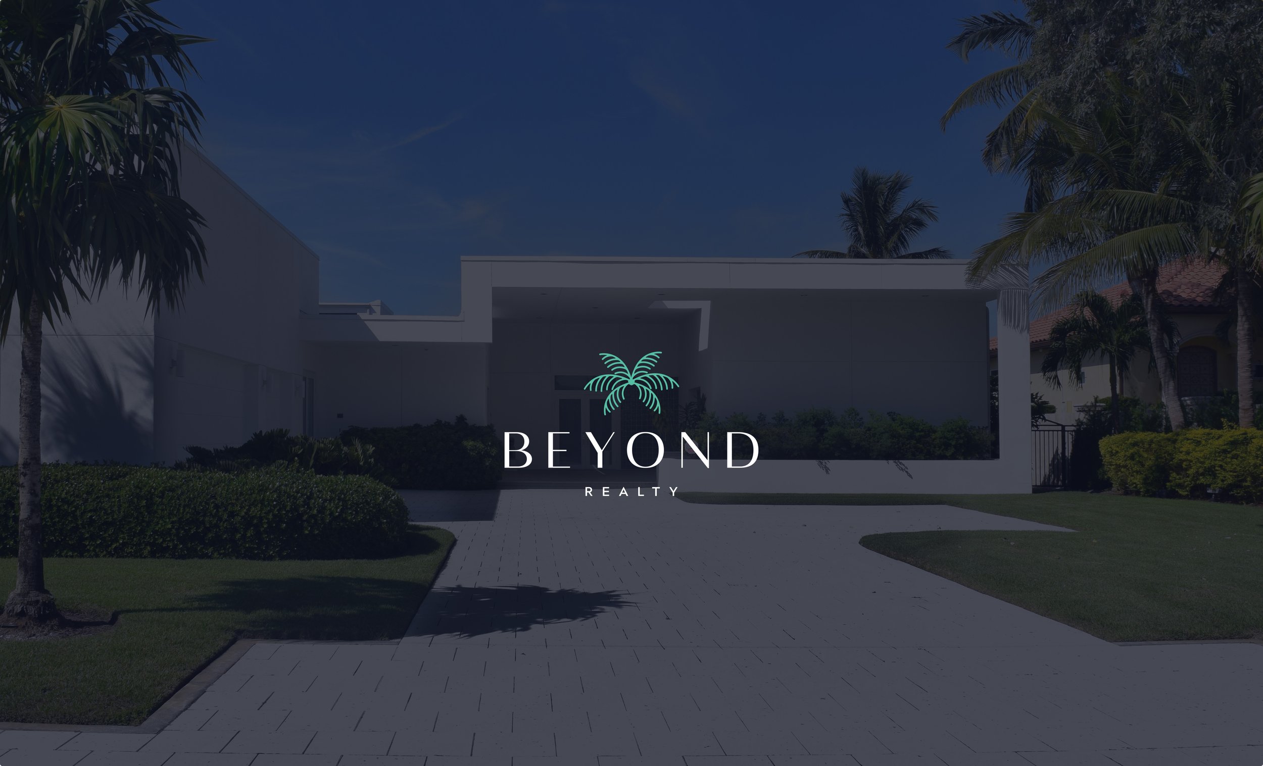
The opulent font chosen for "Beyond," along with a rich navy color, positions the brand elegantly amidst high-end properties. Adding a touch of vibrant teal in the icon and throughout the brand injects a playful and welcoming element. Furthermore, the subtle yet distinctive palm frond pattern, employed consistently across print and digital designs, adds a unique and recognizable touch, effectively unifying the brand's visual identity.


